Sunday, February 26, 2012

Mud Season in Prescott Park

As part of my AOR project with "K", we revisited Prescott Park in Portsmouth. I've never had the opportunity to shoot the same subject matter over so many seasons and it was a challenge to find something new and different this time. Here are some snaps from the shoot:


These four pix were shot underneath the bridge work being done near the gallery:


"K" took it entirely in stride when I jumped into an empty fountain to get the next two shots:


These four pix show the effect of a NH winter:


In a few weeks, "K" and I will be meeting again to edit her images and begin work on preparing a few for the upcoming auction in May. I was also honored that she gave me copies of some of her recent work.

Stay tuned more to see how the collaboration progresses...


4/1/12 UPDATE: One of the photos from this shoot was selected as a second prize in the Winter 2012 portsmouth.com Photo Contest. See the award-winning image here.

Saturday, February 25, 2012

How to Create a Lenticular Flip Image

The following “pre-press” information has been compiled from a number of online resources and test-driven by yours truly. Note that while there is software to interlace images for printing, I used Photoshop in order to learn the lenticular process from the ground up.

_______________________________________

Need to know:

• your maximum printer dpi (DPI).

• and the lenticules (lenses) per inch (optical pitch or LPI) of your target lens. A lenticule is a single optical element, a vertical strip in the lenticular sheet.


Need to have:

• Plastic lenticular lens blank to place over print. Most DIY lenticular lens sheet blanks for 2-image flips appear to be 40-60 lpi and you will probably have to purchase them online, because it's highly unlikely that they would have hit your local crafts, photo, or office supplies store yet.


_______________________________________


A. Preparing your images for interlacing:

1. Select two images with the same proportions and scale them to the same size. For example, a 60 LPI lens would have a file output resolution of 120dpi for a two –image flip. A 6x4” print at 120 DPI would be 720 pixels x 480 pixels.
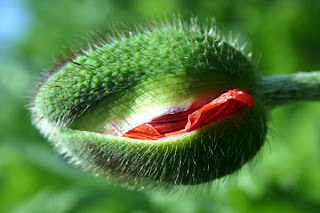
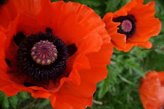


2. Copy one of the images, then paste it into the other file. (This will automatically create a new layer.)

3. Create an empty third layer and name it “Pattern Mask.”


B. Creating the Pattern for the “Pattern Mask” layer:

1. Create a new document from the “File/New” menu.

2. Set “Width” and “Height” to 2 pixels (corresponding to the number of images you will be interlacing).

3. Set the resolution and color mode to match that of your two images.

4. Select “Transparent” content, so you can see underlying grid.

5. Then “OK” to finalize the file.

6. Zoom to the maximum and use the selection tool (“Marquee tool”) to select a column 1 pixel wide x 2 pixels deep.

7. Go to “Edit/Fill” and select “Black” from the “Content” drop-down menu.
8. Select the inverse and fill with white.

9. “Select All”; then choose “Edit/Define Pattern” and save the pattern.


C. Interlacing the images:

1. Go to “Pattern Mask” layer and select all.

2. Select “Edit/Fill”. Under Content,” choose “Pattern” and select the pattern you just made.

3. Under “Selection”/Color Range,” select “Shadows” (to select the black lines.)

4. Keeping the” Pattern Mask” layer highlighted, go to the background layer and unlock it.

5. Select “Layer/Add Layer Mask/Reveal Selection.”

6. Go back to the “Pattern Mask” layer and move it for one pixel to the right. (Make sure the move tool, not the selection tool, is selected before hitting right arrow.)

7. Under “Selection/Color Range,” select “Shadows”( to select the black lines.)

8. Keeping the” Pattern Mask” layer highlighted, go to the layer for the second picture.

9. Select “Layer/Add Layer Mask/Reveal Selection.”

10. Hide (or delete) the pattern mask layer.

11. Flatten layers and save your result.
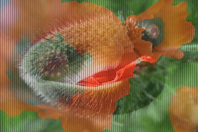


12. Print at home at appropriate DPI or output at your local photo lab/service bureau.

13. Insert lens sheet in front of printed image or insert image into a lenticular frame.
_______________________________________

The resultant image above looks a little goofy because it does not have a lenticular lens in front of it. (But it doesn't look nearly as goofy as I looked pacing around my PC from all angles to see if I could see the picture "move"... despite no appropriate lens sheet.)
_______________________________________

UPDATE: I'm playing with the idea of having one image when viewed head-on and the second image which is the same when viewed from either side. This would require another lawyer. Also, at 60 lpi, this would require a file output resolution of 180dpi and a 3-pixel pattern mask whose pattern is 1 pixel wide x 3 pixels deep.

_______________________________________

Monday, February 20, 2012

Field Trip to MOBA

Buckle up, art fans!


Today, we take a virtual tour of the Museum of Bad Art (MOBA) in Dedham, MA. According to the MOBA web site: "The Museum Of Bad Art (MOBA) is a community-based, private institution dedicated to the collection, preservation, exhibition and celebration of bad art in all its forms and in all its glory."


In addition to the web site, there are three brick-and-mortar locations, all in the Boston area. The Dedham "gallery" is in the basement of the iconic Dedham Community Theatre, right in front of the urinal area (and you thought they just had a world-class collection of Marcel Duchamp "porcelain fountains.")

Here's a representative sampling of what was showcased there when "Vinnie VanG", my hushand Darren, and I visited today:


(I think this one was called something like "the Contortionist.")


(as I recall, this one was called "Ferret in a Brothel")


and make sure to check out their "crown jewel" (while it looks frightening like me, it's a version of the Italian lady with the famous half-smile):


Admission is free and the Museum is open whenever the Theatre is open. The Theatre sells MOBA souvenirs and donations are always welcome. (Even bad art needs patrons and supporters...)

Sunday, February 19, 2012

Not Usually Inspired by Modrian

but once in a while, I'll make an exception:

Saturday, February 18, 2012

Tuesday, February 14, 2012

Restraint (or not becoming a slave to technology)

This AM, I read a Facebook status update from a woman I met last weekend at the Pond Hockey tournament. She noted that she had to clean out her hard drive to make room for the more than 1400 pictures she shot there. After photoediting and photoshopping, I had about 150 images. Here are my thoughts and impressions on what I think the difference between our approaches might be:

(1) Know your story before you pick up the camera. You'll shoot smarter and happier if you know what you're trying to capture.

(2) In-camera editing. Some images are so lousy that you can tell just by reviewing them in your digital camera's viewfinder. Take a break now and then to review your images and delete the lemons before you even get home.

(3) Duplicates. We all like to take multiple images of "important" subjects. But unless you sell stock images, is there really a need to save more than a few versions of the same shot?

(4) File formats. If you're just shooting snapshots for fun, do you really have to shoot in RAW format?

(5) Storage issues. As my Facebook friend is finding out, it takes a lot of space to save 1400 photos. But don't scrimp on multiple backups: make sure any image that's important to you is saved at least twice, preferably in different locations. Consider off-site/online storage.

(6) Value your own time. At an extremely conservative 6 pictures a minute, it will take nearly four hours just to view 1400 photos! If you want to save each image and make minor color in Photoshop/crops in Photoshop at 3-5 minutes apiece (assuming no batch processing), you're looking at another 70-117 hours!

(7) Think about what images the subject may not find flattering. Be kind and delete cringe-worthy pix. Wouldn't you want them to do that for you?

(8) My new friend was far more generous and thoughtful than I was. While I focused primarily on my two family members, she was taking pictures of all the players.

(9) "Take your own temperature" and reassess when photography becomes more of a chore than a passion.

(10) Break your own rules when something unexpected happens.

Sunday, February 12, 2012

Pond Hockey, Part 3

Photo editing is going slowly, partially because this was about the only way to stay warm during the final day of the competition:


and my fingers are still numb from the cold. ("Serendipitously", my apartment building was on fire when we got back - true story! -- so I am warming up fairly quickly after that.)

Here are a few photos so far:


Saturday, February 11, 2012

Simulating Infrared Photography

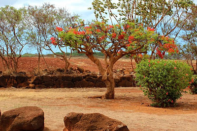
To improve image quality, many digital cameras employ infrared (IR) blockers. Depending on the subject matter, infrared photography may not be practical with these cameras because the exposure times become overly long. Some people modify their digital cameras by removing the infrared blocking filter. Others use a infrared filter. But what happens when you want both a "regular" image and an IR one?

It's relatively easy to simulate an IR look by manipulating an existing digital file.


I found a "recipe" online for simulating the look of infrared photography via my old version of Photoshop from someone who allegedly (sorry, I can't help from slipping into "lawyerspeak" now and then) nicked it in 2004 from Digital Photo magazine. I found it worked best on landscape photos, like the one above.

(1) Channel mixer: monochrome. Start all at zero, whack the Blue to -150%, then Red up to around 150%, tweak with some green. If lots of foliage, do the green first, and add some Red (say 30%). You've got to fiddle around to get the best results (but start with blue down first)

(2) To simulate the glow around the highlights that IR film gives:
* Click D to reset foreground/background colours to Black/White
* Filter / Distort / Diffuse Glow
* Graininess=0, Glow Amount=1, Clear Amount=9

(3) Then add realistic grain (on a separate layer:
* Call up layers palette
* New empty layer
* Edit / Fill - 50% gray
* Blend mode to Overlay
* Filter / Noise / Add Noise
Gaussian, Monochromatic. Between 10-20%
* Filter / Texture / Grain
Grain Type = Enlarged
Intensity = 0 (for B&W)
Adjust Contrast (around 30)

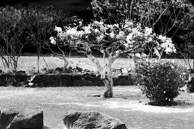
Here's the result of the first effort:


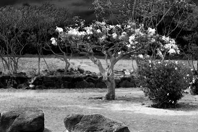
However, I wasn't happy with the sky, so I started again. Note the Photoshop receipes are like cooking recipes: you have to experiment to find out what you like best...


Note that this version also has less severe shadows in the bush and rocks at the foreground. Here's the revised recipe:

(1) Channel mixer: monochrome. Start all at zero, reset Blue to -150%, reset Red to 100%, green=8.

(2) * Click D to reset foreground/background colours to Black/White
* Filter / Distort / Diffuse Glow
* Graininess=0, Glow Amount=1, Clear Amount=13

(3) Then add realistic grain (on a separate layer:
* Call up layers palette
* New empty layer
* Edit / Fill - 50% gray
* Blend mode to Overlay
* Filter / Noise / Add Noise
Gaussian, Monochromatic. Between 10-20%
* Filter / Texture / Grain
Grain Type = Clumped
Intensity = 0 (for B&W)
Adjust Contrast (around 30)

Pond Hockey, Part 2

So how do you tell the story of a warm-weather cancellation?


Here's to hoping some of the games will be rescheduled for tomorrow....

Pond Hockey, Part 1

This is what happens when a hockey player asks his photographer wife (who doesn't do event photography) to shoot a Pond Hockey Tournament:


I may post a few action photos later, once we actually make it to the pond...

--------

2/25/12 update: this photos will be appearing at the NH Art Association gallery during the month of March 2012.

Thursday, February 9, 2012

Contest News: Buddhist Library Photo Contest Finalist

This morning, I received notification that one of my photographs has been accepted as a finalist in the Buddhist Library's (Singapore) 30th Anniversary Photo Competition. (It is unavoidably anachronistic to use the words "Buddhist" and "competition" in the same sentence.) As a 2011 finalist, my image is now in consideration for the Grand Finale, to be held later this year.

The contest organizers inform me that this is the first time that a U.S. citizen has entered the competition. As a relatively new practitioner (of both Buddhism and photography), it's daunting to have this distinction.

All 2001 Finalist images can be seen here.

Here's the image the Library selected from the five images I submitted:


(Ironically, it's a close-up of a mass-produced resin Buddha statute imported from Asia and purchased at Home Goods!)

All of my submissions may be viewed here.


Stay tuned!